What Should a Small Business Landing Page Actually Include?
A good landing page doesn't need dozens of sections. Here's what a small business landing page actually needs to communicate clearly and guide visitors toward action.
A good landing page doesn't need dozens of sections. Here's what a small business landing page actually needs to communicate clearly and guide visitors toward action.
small business website doesn't need to be complicated.
You don't necessarily need ten pages, dozens of animations or endless sections.
What you need is a page that quickly answers three questions:
What do you offer?
Why should I care?
What should I do next?
Here are the essential elements I recommend starting with.
1. A Clear Headline
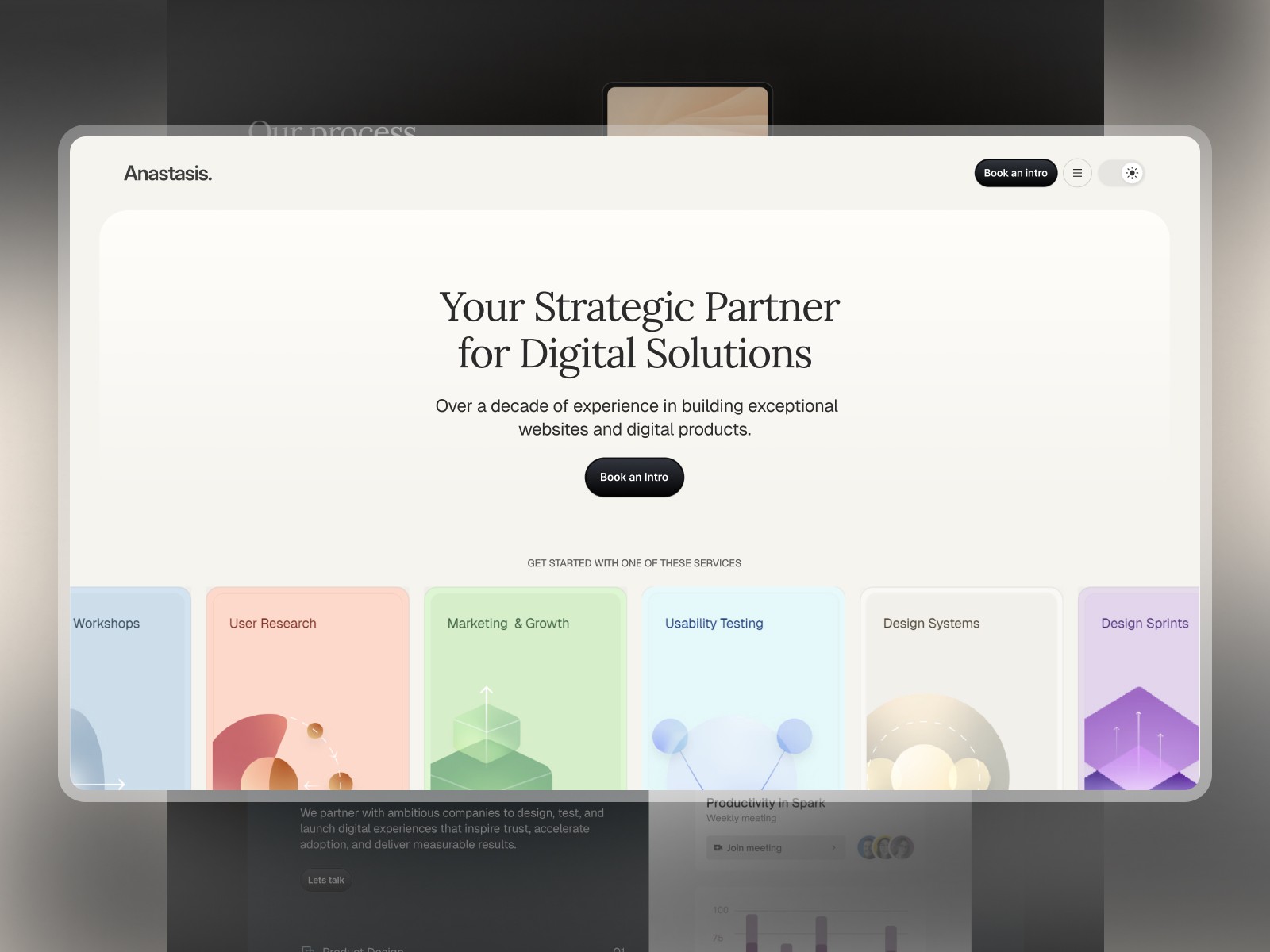
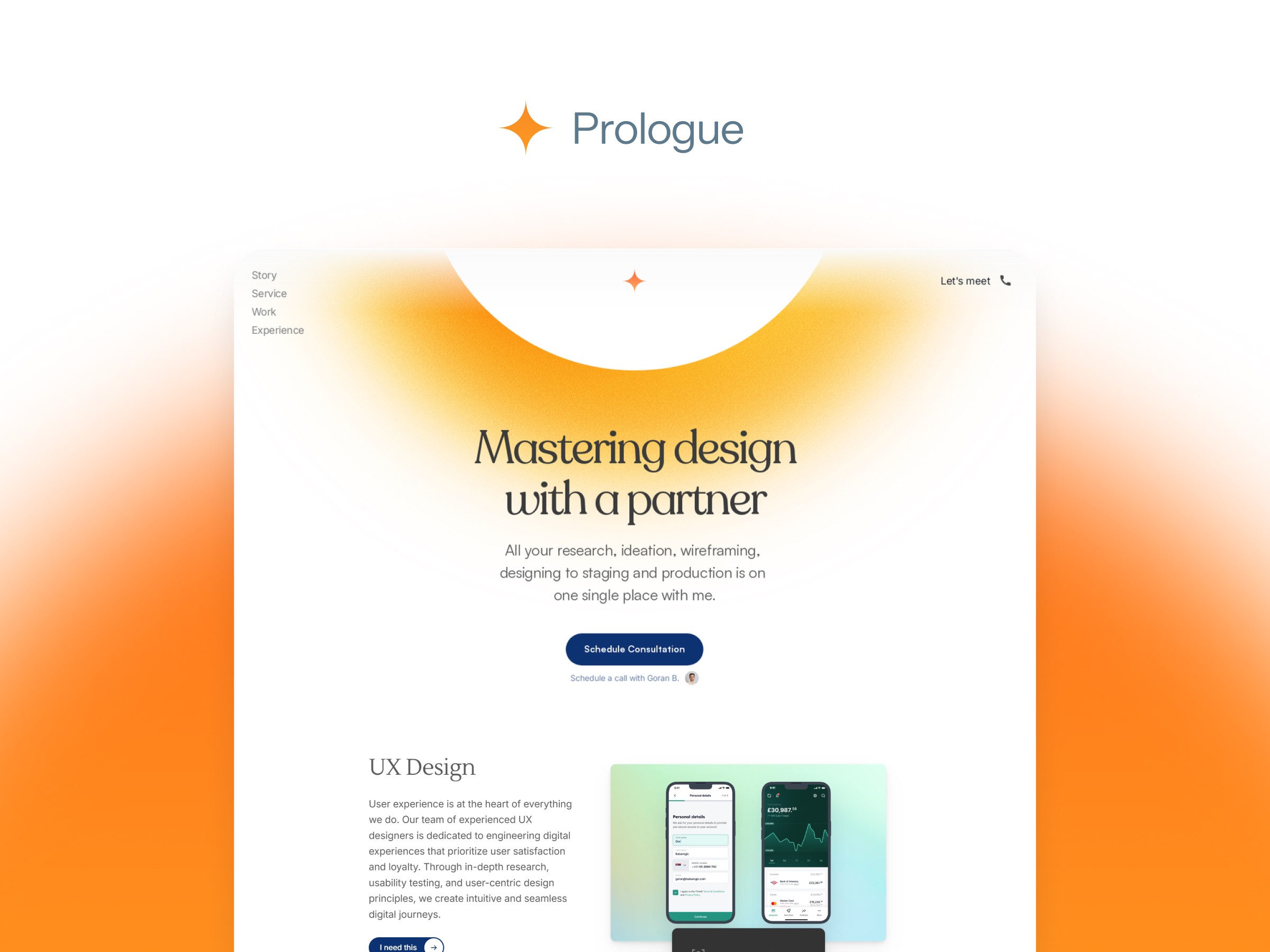
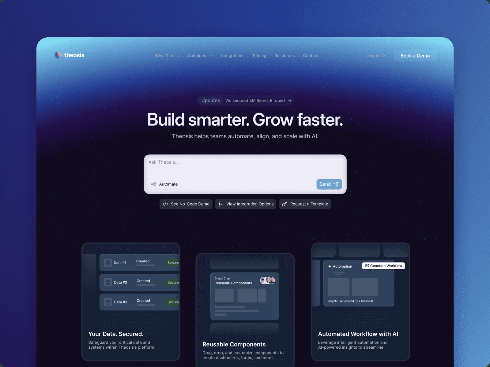
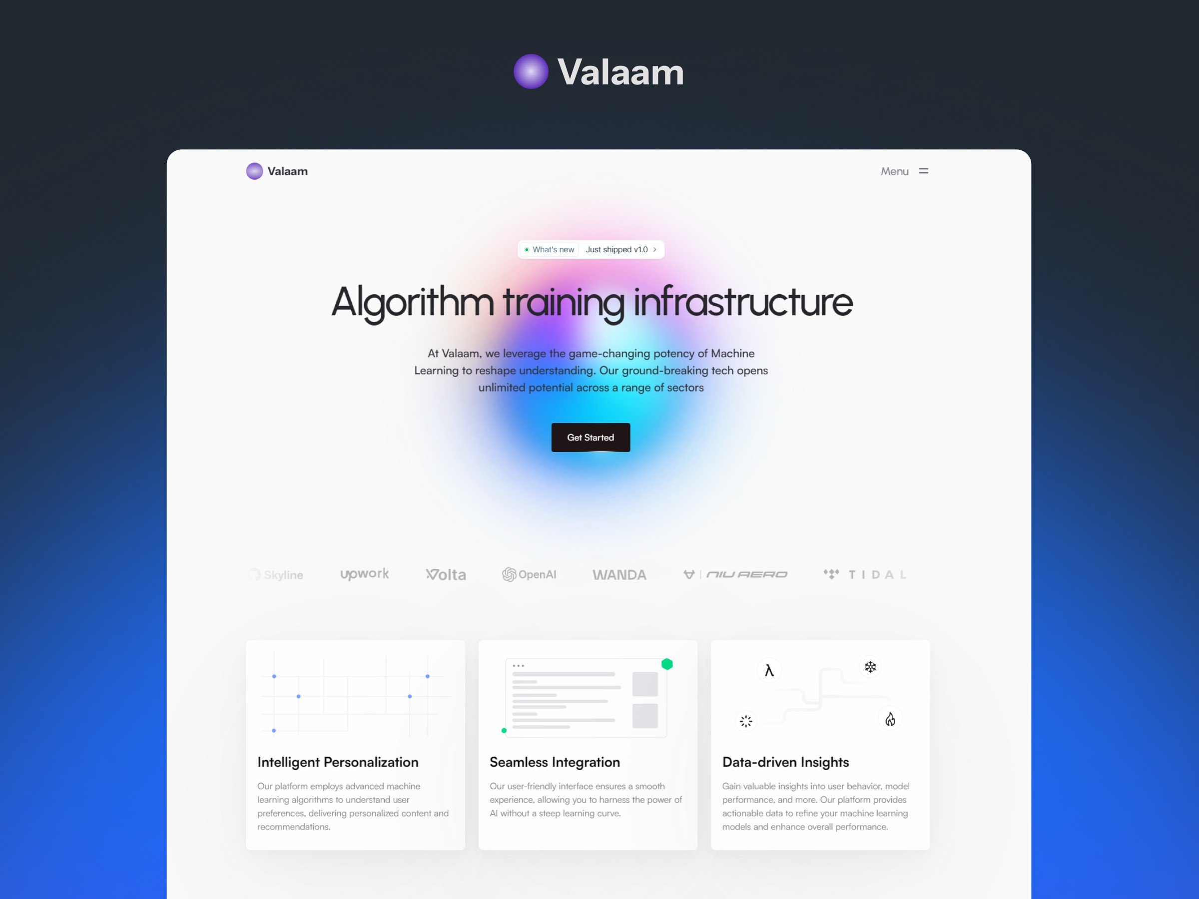
Your headline should tell visitors what you do and who it's for.
Avoid vague statements that sound nice but don't communicate anything.
Instead of:
“Helping you achieve more.”
Try something specific:
“Accounting services for growing small businesses.”
Clarity wins.
2. A Supporting Value Proposition
Your headline gets attention.
The supporting copy should explain the value behind the offer.
Keep it concise and focus on the customer's problem or desired outcome.
3. One Primary CTA
Don't make visitors decide between five different actions.
Choose the most important next step.
For example:
Book a Consultation
Get a Quote
Start Your Project
Request a Demo
Repeat the CTA naturally throughout the page when appropriate.
4. Show What You Actually Offer
Visitors shouldn't have to dig through paragraphs to understand your services.
Use clear sections, short descriptions and visual hierarchy to make the offer easy to scan.
5. Build Trust
People need a reason to believe you can deliver.
Depending on the business, this could include:
Testimonials
Client logos
Case studies
Reviews
Certifications
Results
Experience
You don't need all of them.
Use the strongest proof available.
6. Make It Easy to Scan
Most visitors aren't reading every word.
They are scanning.
Use:
Short paragraphs
Clear headings
Visual hierarchy
Adequate spacing
Strong section structure
Good design helps visitors find the information they need quickly.
7. Design for Mobile
A landing page that looks great on desktop can still fail on mobile.
Check:
Text size
Button size
Image scaling
Section spacing
Navigation
Form usability
Horizontal overflow
The mobile experience isn't an afterthought. It's part of the design.
Final Thought
A high-quality landing page isn't about adding more.
It's about removing confusion.
When the message is clear, the visual hierarchy is intentional and the next step is obvious, the page has a much better chance of turning visitors into enquiries.
Need a landing page designed around your business goal?